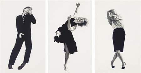
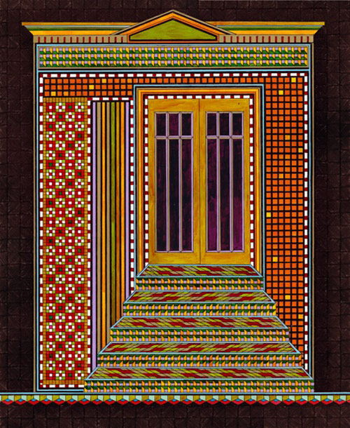
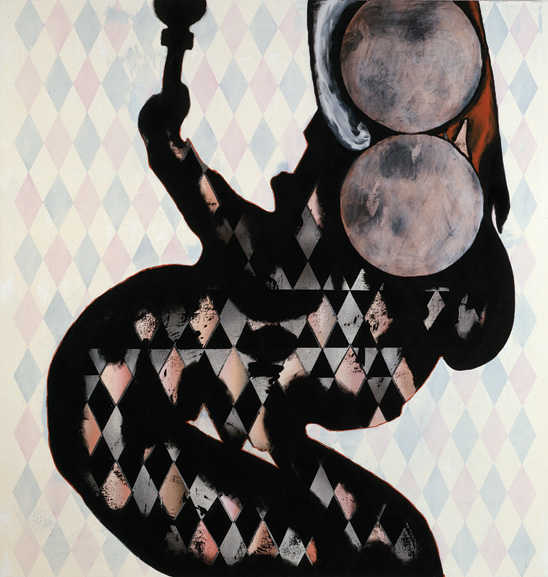
When the page finally loaded with his art I gasped and said "oh, I DO like these!" out loud to nobody because I was alone. Which really says something about how much I like them. They are boisterous and loud but at the same time real. I like that he does not neglect the backgrounds. They are gorgeous patterns and I love their muted shades that contrast so much with the choice of object in the foreground.

(
source)

(
source)
This is my favorite one I have looked at out of all of them including portraits which I usually love the most. I like the background and I like the bright red of the pomegranate I love that it looks so clear and clean and like they were picked at the peak of ripeness and each little jewel is ready to eat. I love how shiny everything is. The crystal bowl adds so much to it. I don't know this is very inviting to me, I would happily live in this house with its antique wall paper and crystal serving dishes and large amounts of expensive fruit. I hope he ate it after.

(
source)


